UX-Led Redesign for a Local Tennis Academy
Turning a content-heavy, outdated website into a clearer, more accessible, and conversion-oriented experience
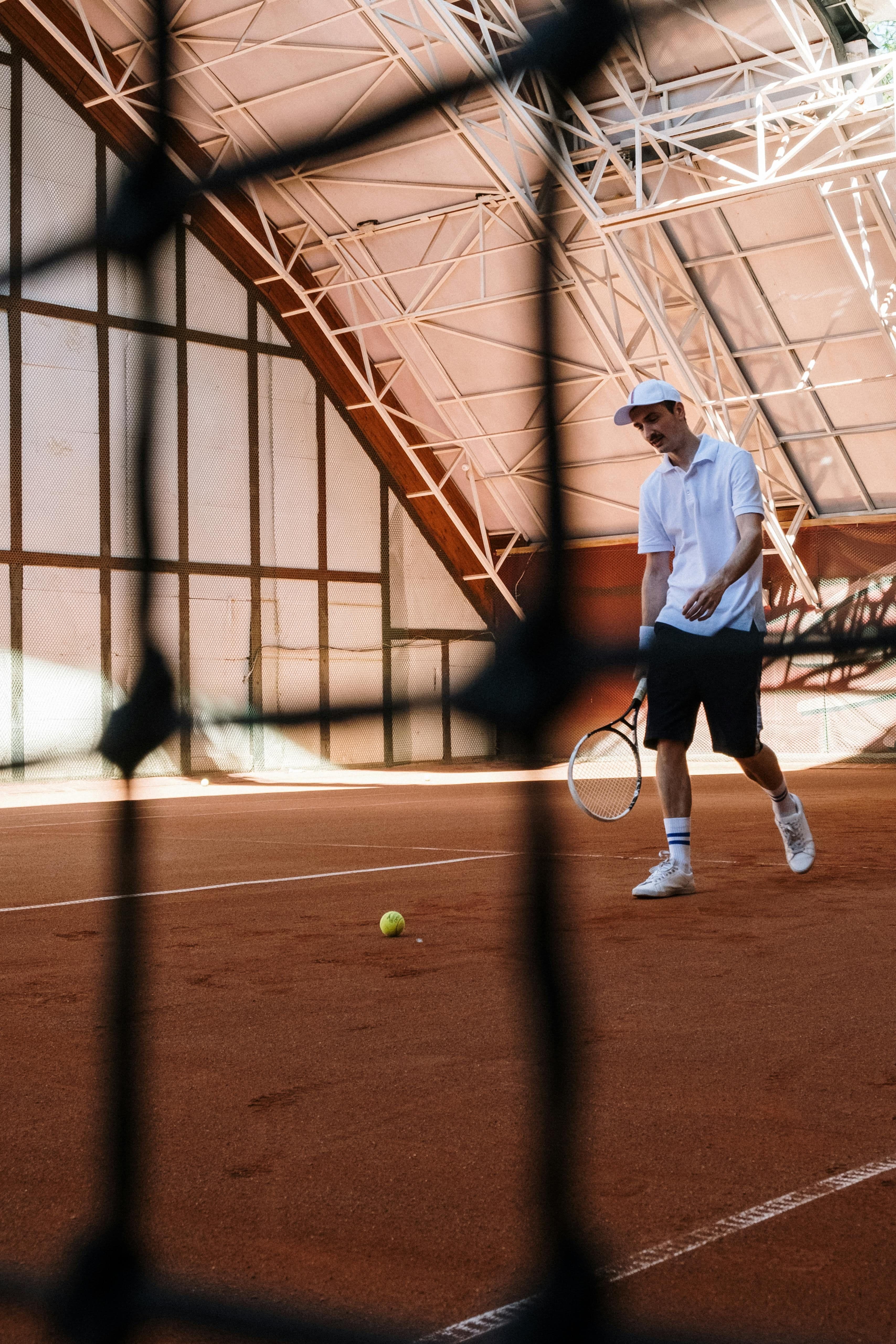
Why this mattered
The Napoli Tennis Center is a highly regarded sports academy, recognised nationally for training quality and results. However, its digital presence did not reflect this excellence. The existing website was text-heavy, visually dated, and difficult to navigate—especially on mobile—making it hard for users to understand offerings, find practical information, or take action. This project mattered because the website played a critical role in first impressions and decision-making. Parents looking to enrol their children, adult learners seeking courses, and athletes evaluating training opportunities all relied on the site to answer practical questions: What programs exist? Is this right for me? How do I get started? Through a structured discovery phase, I identified key issues: 1. Navigation was organised around the organisation rather than user needs 2. Calls to action were unclear or missing 3. Accessibility issues (contrast, alt text, semantics) created barriers for some users 4. Important information was buried in long, descriptive pages The redesign reframed the site around user goals instead of institutional structure, introducing clearer information architecture, stronger visual hierarchy, and explicit conversion paths. Personas and journeys highlighted distinct needs across adults, parents, and users with accessibility requirements, ensuring the experience was inclusive and purposeful rather than purely promotional. This case study demonstrates how UX research and design can translate organisational excellence into digital clarity.